inspiration · Mount Warning · photography · spiritual

Psychology of Colours ~ Naturally Blue!

blue 1

In the year 2000 I started up a machine embroidery business in our local shopping centre, inheriting the brightly coloured shelving and cupboards from the previous business that had been there. Whilst I could cope quite happily with the bright yellows and the vivid reds in the shelving, that royal blue colour simply had to go! How could I arrive at work each day to be greeted by that colour? It would be downright depressing!

If you look carefull, you may just see a tiny lighthouse, way off in the distance.
If you look carefully, you may just see a tiny lighthouse, away in the distance.

What seemed to me to be a rather odd reaction, (from myself!) could have had some psychological bearing on it. My new shop was to be a fun and uplifting colourful business, and that deep blue colour was way too conservative for my liking!

With that in mind, it should come as no surprise for you to read the following passage about dark blue ~

“Dark blue is the colour of conservatism and responsibility. Although it appears to be cool, calm and collected, it is the colour of the non-emotional worrier with repressed feelings, the pessimist and the hypocrite. Dark blue can be compassionate but has trouble showing it as its emotions run deep. Dark blue is a serious masculine colour representing knowledge, power, and integrity, and is used quite often in the corporate world.”

So that’s why the dark blue colour wouldn’t work for me in my new store, my new feminine shop, where I expected to (and did have!) great enjoyment in choosing embroidery thread colours to match with articles of colourful clothing, to be added into logos on caps and shirts, and my favourite part of the business, choosing colours for adding designs and monograms to bath towels.

The colours of nature.

Blue is a colour associated with peace and tranquility and its presence creates a calming atmosphere. Think about the last time you sat beside the vivid blue ocean or a blue river, doesn’t the whole atmosphere of the blue waters make you feel calm? I know it has that effect on me. And when Mount Warning appears to have a tinge of blue haze, overpowering the green trees, there’s nothing quite so calming.

During an early mist morning, the colour blue overpowers all the other colours of the valley.

The colour blue suggests devotion, loyalty, trust and honesty, encourages self-expression and is also regarded as a spiritual colour.

Did you realise that blue is the most universally liked colour out of the whole colour spectrum? Perhaps the reason for this is that blue is regarded as a non threatening colour which promotes calmness.

The blue sky likes to overpower the white fluffy clouds sometimes.

People who favour the colour blue are slow to trust others, preferring to get to know a person before they trust completely. They also wish to be trusted themselves, and beneath their outwardly confident persona may lie a person lacking in confidence.

Blue loving people are usually genuine and sincere, prefer to enjoy the company of a close set of friends, are sensitive and caring towards the needs of others but also need their “alone” time, to reflect and contemplate their lives. Blue is a colour associated with meditation.

Four Galahs with not a care in the world when the sky is so blue!

Blue people tend to be guided by their heart, can be sensitive, emotional and sentimental and cry easily over sad movies. On the other hand, they enjoy order in their lives, cannot work amid chaos and can also be stubborn and set in their ways.

They have a thirst for knowledge and wisdom, are friendly and approachable people and have an ultimate need for inner peace and harmony in their lives.

Butcher Bird on Blue.
A happy Butcher Bird, singing out loud to the blue autumn skies.

I wonder if any of you, who would name blue as your favourite colour, can identify with any of these characteristics? Although I wouldn’t claim blue as my favourite colour, when I see the colour blue in nature, a bright blue sky on a sunshiny day, the gradual changes of the colour blue as it reaches down into the depths of the ocean or even blue flowers, I can feel quite overwhelmed and emotional by the majesty of nature.

All of my children are blue-eyed, and I think it really goes without saying that when I look into the varying shades of blue in their eyes, I can simply melt like butter!

The Blue Willow.
The Blue Willow.

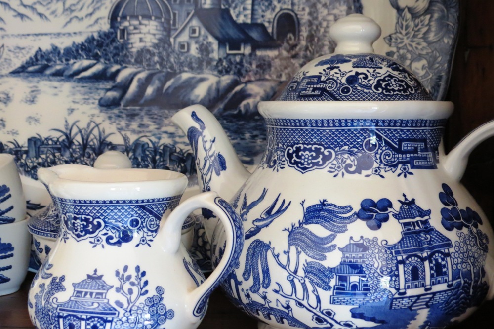
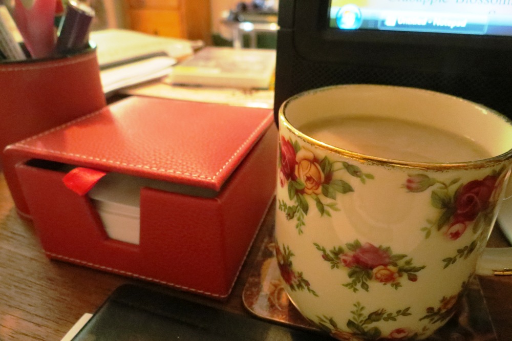
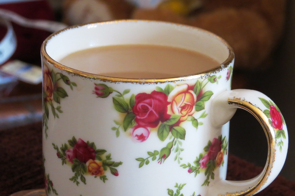
Another object of my deepest affection when I think about the colour blue is the Willow Pattern design I have loved since my childhood days. Seeing my Willow dinner set in my cupboard gives me a sense of comfort and security. (Wait a minute, security is one of the characteristics associated with the colour blue!) There is a story to the Willow pattern design, which goes like this ~
“Koong-She, a mandarin’s daughter, loved her father’s secretary, Chang. Father, having arranged a marriage with a wealthy suitor, shut her in a terrace house, to be seen close by the temple on the right of the plate. Chang rose to the occasion and rescued the maiden, although hotly pursued by the father across the bridge.

The couple lived happily, almost ever after, in Chang’s little house across the harbour. However, eventually the frustrated suitor found them and burnt the house down while they were sleeping. True love never dies, and Koong-She and Chang arose Phoenix like from the ashes, in the form of two doves.”

There is a poem of the Willow pattern story, which apparently many children learn at school, although I didn’t. Fortunately though, I do have a copy of the poem ~

“Two pigeons flying high, Chinese vessel sailing by, Weeping willow hanging o’er, Bridge with three men if not four, Chinese temple, there it stands, Seems to cover all the land, Apple tree with apples on, A pretty fence to end my song.”

A Brahminy Kit, soaring through the great blue sky.
challenges · daughter · enchanting · inspiration · photography · spiritual

The Psychology of Colours ~ The Colour Purple

purple

“Listen, God love everything you love – and a mess of stuff you don’t. But more than anything else, God love admiration.

You saying God vain? I ast.

Naw, she say. Not vain, just wanting to share a good thing. I think it pisses God off if you walk by the colour purple in a field somewhere and don’t notice it.”

~ Conversation between Shug and Celie, as told by Celie to her sister Nettie in a letter. From the book The Colour Purple written by Alice Walker.

If I were asked to pick one colour as my most favourite of all colours, I know that I would not choose the colour purple, yet I can totally relate to the quote above from the book “The Colour Purple”. I’m sure my heart skips a beat when I see a purple flower, or anything in nature showing the colour. I even love to see purple in the sky, although it is usually a sign of imminent, or earlier, bad weather.

After wild weather, as the colour purple shares the sky with some orange.
After wild weather, the colour purple shares the sky with an orange sunset.

As a child, one of my girls absolutely loved purple, everything she owned had to be purple, there were no if’s or but’s about it, so I did a bit of research on purple to find out, if anything, what a love for the colour signified. The one thing that struck me the most all those years ago was how purple was regarded as a spiritual colour. My daughter, who was crazy for the colour, could look deep inside a person’s soul. Even today, at age twenty, she “feels” her way through life, like no other young person I have ever met.

In the Catholic Church, the colour purple is worn by cardinals and bishops and during lent is regarded as the colour of pain and suffering. Up until the mid twentieth century, purple was regarded as the colour for mourning in England.

Thought of at one time as a regal colour, purple fabric was so expensive that only the rich in society could afford clothing made from purple, therefore purple became a status colour, worn only by the wealthy or privileged.

Buddleia's are also known as the Butterfly Bush. If I were a butterfly I'm sure I'd love to sit in the sunshine on this flower, enjoying the colour.
Buddleia’s are also known as the Butterfly Bush. If I were a butterfly I’m sure I’d love to sit in the sunshine on this flower, enjoying the colour.

So having established that purple has enjoyed quite a colourful history throughout the centuries, what effect does the colour have on our personalities?

Besides being a spiritual colour, purple, and the lighter shade of violet, are both connected to the imagination and intuition. Lovers of purple will want to run their own race as individuals, are often surrounded by mystery, can be psychic and can live in a world of fantasy, needing to escape the realities of the world. Purple lovers are often the daydreamers among us and being around the colour has a calming effect on the person.

The negative aspects of the colour purple, especially a liking for the darker shades, can be that the person is possibly immature, can be cynical and arrogant and can at times be seen as a social climber. It can also represent loneliness and mourning.

I love the plum coloured beading on this lamp.

But lets not dwell too long on the negative aspects of this most distinguished of all colours. Something that you may not know about the colour purple, being a combination of the colours red and blue, it possesses the strength of the colour red, combined with the integrity of the colour blue.

And here’s another thing you may not know about what I have written here, and the photos I have added showing The Colour Purple in my life ~ this is my contribution to Karma’s “Colours of Your World” photo assignment. And it gets even better, after Karma red read my last post here, “The Psychology of Colours ~ Featuring the Colour Red”, it gave her the inspiration for her latest photo challenge!

It's lilac, and it features nature, so this picture gives me great enjoyment.
It’s lilac, and it features nature, so this picture gives me great enjoyment.

Karma has set the deadline to get the assignment in by April 28th (but she’s pretty cruisy about deadlines!) so if you too feel inspired, why not join in the challenge and add a post with photos of some of your favourite, or not so favourite, colours.

I’m enjoying learning about the psychology of colours so much, and there seemed to be quite a bit of interest in my findings on the colour red, so I’ve decided to feature a new colour each week, (until I run out of colours!)

How do you feel about the colour purple, do you love it, or loath it? It could be fascinating to look at the reasons why you feel the way you do. 🙂

These tiny violets are a beautiful ground cover in my garden.

The Violet ~ Johann Wolfgang von Goethe (Written 1773)

A violet blossom’d on the lea,
Half hidden from the eye,
As fair a flower as you might see;
When there came tripping by
A shepherd maiden fair and young,
Lightly, lightly o’er the lea;
Care she knew not, and she sung Merrily!

dark purple in excess can be strict, foreboding, lonely, mournful or even pompous. – See more at: http://www.feng-shui-and-beyond.com/meaning-of-purple.html#sthash.AgYDczVY.dpuf
advice · inspiration · knowledge

The Psychology of Colours ~ Featuring the Colour Red

???????????????????????????????

“Red is the great clarifier – bright and revealing. I can’t imagine becoming bored with red – it would be like becoming bored with the person you love.” ~ Diana Vreeland.

The WordPress Weekly Photo Challenge announced a week ago invited us all to add a post about colour. Even though I didn’t add anything during the allocated week it did have me pondering colour yet again, and more to the point the psychology behind colours.

Varying shades of red...
Varying shades of red…

My favoured colour has always been within the range of red, although the colour that I would call “fire engine red” is one that I use sparingly. My preference begins within the range of pinks, but excluded baby pink, which I only like for babies, and hot pink which is great for the young. The photo above shows the colour of the walls in one of the rooms of my house, which is more of a dusky pink.

Various shades of pink in the curtains.

As you can see here, Miss Tibbs is the focal point of the above photo, but take a look behind her and you will see various shades of pink in the curtains. These poor old curtains have seen better days now and will one day be replaced. When I have worked out what I would like to replace them with, that is!

There are shades of red in the office too.

Even on my office desk I have some red items, although as I look around this room I don’t see a lot of definite colour in the room. What is there, however, is pink to reddish tones.

More varying shades of the colour red ~ they are everywhere!

I’m working on a new knitting project just now (more about that at a later date though!) and the colour that I was immediately drawn when choosing the wool was maroon.

My Very Comfy Favorite Chair is burgundy, there are pink and red splashes of colour on the quilt over the arm of the chair and even my coffee cup, a Royal Albert Old English Rose design, has red roses on it.

So what does this all mean? Red is known as a colour of warmth and strength, a power colour, promoting a strong will and confidence. Red is also known as the colour of passion and love. Think about the number of red roses sold on Valentine’s Day and when a love-heart is shown in colour, it always appears in the colour red.

Keywords of the personalities of those who favour the colour red are ~ optimistic, courageous and confident, action oriented, energetic, ambitious and competitive.

Red colour people are explorers and pioneers, and on the down side can also be aggressive and argumentative. They have a need for power, like to control and are hard workers.

The colour red is regarded as a lucky colour in Chinese culture and is a sign of purity in Indian culture and a touch of red is often added to a wedding dress to symbolise the bride’s purity.

My appetite usually does need any help getting motivated, but apparently my red bowls are helping anyway!
My appetite usually doesn’t need any help getting motivated, but apparently my red bowls are helping anyway!

Also known to stimulate an appetite, red is often used in the advertising and business colours of food outlets. (I’m thinking of McDonald’s here!)

Too much of the colour red surrounding a person can also have an adverse reaction, making them feel irritated, even to the point of becoming angry. If a person is feeling unwell or under any kind of emotional stress, red is a colour to steer clear of, due to the high energy levels that red generates.

It is suggested that a dislike of the colour red suggests that you may find anger, which too much red can promote, a difficult emotion to cope with, therefore you will avoid the colour. Hmm, I can totally relate to that! Too much bright red really can upset my equilibrium, to the point of feeling extremely agitated and I don’t cope with that feeling well at all!

However, like I said, I have a preference myself for varying shades of red, so I have researched this aspect of the colour also. I don’t see myself as a power-hungry explosion of energy, that’s for sure, which is how a red personality person seems to be portrayed, so here are some variations on the differing shades of red ~

Those who are drawn to the colour maroon are more controlled in thought and action than their red-favouring friends.

Burgundy is associated with a more serious and sophisticated personality, and is less energetic than a “red” personality. (Whew, that’s a relief to know!)

Those who favour crimson are still known to be determined to succeed, but will do so without stepping on anyone’s toes, unlike their red loving friends.

Scarlet is also known as a less intense colour, indicating enthusiasm and a love of life.

Favouring the colour pink is a whole separate topic again, but just as the colour is softer than red, the suggestion is that “pink” people are much gentler in personality.

So as you can see, there are many diversions to the psychology of a colour, it’s not just a simple matter of the associated personality traits all being “black and white” (yes, pun intended….groan….)

I’ve enjoyed researching the indications of preferences for colours, and how each colour can affect our personalities. I do hope you have enjoyed reading this too, just for a bit of fun.

I’d love to hear your thoughts on whether you agree that colour choices we make and colours we favour can have a psychological impact on us and influence our lives in any way, and whether or not a colour can be associated with a certain personality type.

If enough interest is shown, I may even follow up with some more research into the other “colour” personalities on the spectrum of life, but for now, I think I’ll head off, (wearing my dark red jumper, blue denim jeans and deep pink Ugg boots,) for a cup of coffee, in my red roses cup, of course.  🙂

Cheers!
Cheers!