“Red is the great clarifier – bright and revealing. I can’t imagine becoming bored with red – it would be like becoming bored with the person you love.” ~ Diana Vreeland.
The WordPress Weekly Photo Challenge announced a week ago invited us all to add a post about colour. Even though I didn’t add anything during the allocated week it did have me pondering colour yet again, and more to the point the psychology behind colours.

My favoured colour has always been within the range of red, although the colour that I would call “fire engine red” is one that I use sparingly. My preference begins within the range of pinks, but excluded baby pink, which I only like for babies, and hot pink which is great for the young. The photo above shows the colour of the walls in one of the rooms of my house, which is more of a dusky pink.

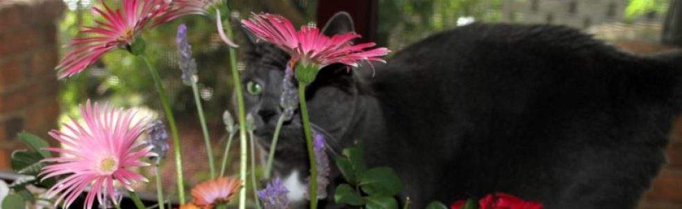
As you can see here, Miss Tibbs is the focal point of the above photo, but take a look behind her and you will see various shades of pink in the curtains. These poor old curtains have seen better days now and will one day be replaced. When I have worked out what I would like to replace them with, that is!
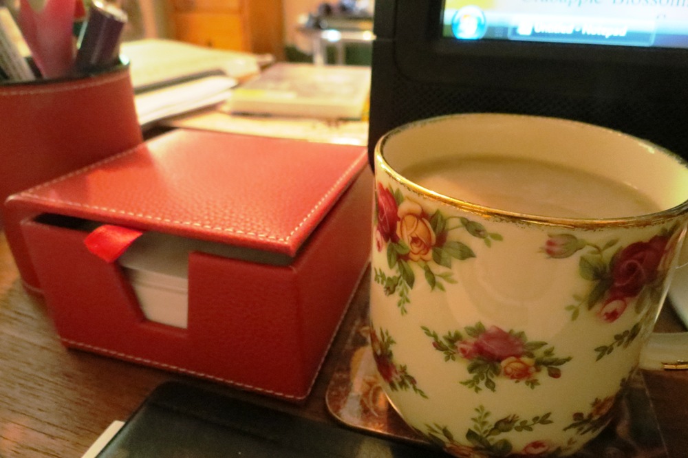
Even on my office desk I have some red items, although as I look around this room I don’t see a lot of definite colour in the room. What is there, however, is pink to reddish tones.

I’m working on a new knitting project just now (more about that at a later date though!) and the colour that I was immediately drawn when choosing the wool was maroon.
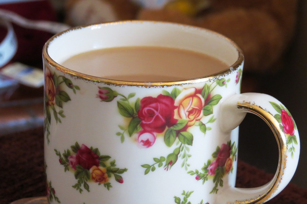
My Very Comfy Favorite Chair is burgundy, there are pink and red splashes of colour on the quilt over the arm of the chair and even my coffee cup, a Royal Albert Old English Rose design, has red roses on it.
So what does this all mean? Red is known as a colour of warmth and strength, a power colour, promoting a strong will and confidence. Red is also known as the colour of passion and love. Think about the number of red roses sold on Valentine’s Day and when a love-heart is shown in colour, it always appears in the colour red.
Keywords of the personalities of those who favour the colour red are ~ optimistic, courageous and confident, action oriented, energetic, ambitious and competitive.
Red colour people are explorers and pioneers, and on the down side can also be aggressive and argumentative. They have a need for power, like to control and are hard workers.
The colour red is regarded as a lucky colour in Chinese culture and is a sign of purity in Indian culture and a touch of red is often added to a wedding dress to symbolise the bride’s purity.
Also known to stimulate an appetite, red is often used in the advertising and business colours of food outlets. (I’m thinking of McDonald’s here!)
Too much of the colour red surrounding a person can also have an adverse reaction, making them feel irritated, even to the point of becoming angry. If a person is feeling unwell or under any kind of emotional stress, red is a colour to steer clear of, due to the high energy levels that red generates.
It is suggested that a dislike of the colour red suggests that you may find anger, which too much red can promote, a difficult emotion to cope with, therefore you will avoid the colour. Hmm, I can totally relate to that! Too much bright red really can upset my equilibrium, to the point of feeling extremely agitated and I don’t cope with that feeling well at all!
However, like I said, I have a preference myself for varying shades of red, so I have researched this aspect of the colour also. I don’t see myself as a power-hungry explosion of energy, that’s for sure, which is how a red personality person seems to be portrayed, so here are some variations on the differing shades of red ~
Those who are drawn to the colour maroon are more controlled in thought and action than their red-favouring friends.
Burgundy is associated with a more serious and sophisticated personality, and is less energetic than a “red” personality. (Whew, that’s a relief to know!)
Those who favour crimson are still known to be determined to succeed, but will do so without stepping on anyone’s toes, unlike their red loving friends.
Scarlet is also known as a less intense colour, indicating enthusiasm and a love of life.
Favouring the colour pink is a whole separate topic again, but just as the colour is softer than red, the suggestion is that “pink” people are much gentler in personality.
So as you can see, there are many diversions to the psychology of a colour, it’s not just a simple matter of the associated personality traits all being “black and white” (yes, pun intended….groan….)
I’ve enjoyed researching the indications of preferences for colours, and how each colour can affect our personalities. I do hope you have enjoyed reading this too, just for a bit of fun.
I’d love to hear your thoughts on whether you agree that colour choices we make and colours we favour can have a psychological impact on us and influence our lives in any way, and whether or not a colour can be associated with a certain personality type.
If enough interest is shown, I may even follow up with some more research into the other “colour” personalities on the spectrum of life, but for now, I think I’ll head off, (wearing my dark red jumper, blue denim jeans and deep pink Ugg boots,) for a cup of coffee, in my red roses cup, of course. 🙂

This is very interesting Joanne. I never really considered the psychology of color and why we may be drawn to particular colors. I’m thinking this could lead to a photo-hunt inspiration! Ideas are percolating in my mind as I write this comment!
LikeLike
Yes!! That sounds like a great idea for a photo hunt Karma! I’m sure I could join in on that one and wouldn’t be hindered by our different seasons. Glad I could (unknowingly!) help with ideas. 🙂
LikeLike
I’m writing the post right now! I’m glad you like the idea – I’m giving you all the credit for my inspiration!
😀
LikeLike
That’s fantastic! I just noticed it’s after midnight here, so I’ll check my emails for your new post first thing in the morning! 😀
LikeLike
I remember once reading that you should wear red to job interviews.
LikeLike
That’s right Cath, it gives the prospective employer the impression that you are confident, even if you are shaking in your shoes! 🙂
LikeLike
In recent years I’ve found myself wanting winey red spots of color in my decor. Hmmm. Have I become more confident? Or more of a control freak? Very interesting.
LikeLike
I would say you are becoming more confident Carol, as you say you are liking winey red, which is a darker tone of red than the classic, full-on bright red colour. That’s the interesting thing about the preferences for colours, there are so many variations to the shades, and therefore the traits, of those who have the liking for a colour.
LikeLike
There are two colors that I just do not like: red and purple. Why is that? I don’t mind less intrusive reds, like burgundy, but I don’t care for any shade of purple. For some reason, when I see purple, I am reminded of death. I wonder what the psychologists would say about that!
My favorite color happens to be brown. Yes, brown. ❤
LikeLike
Funny you should mention purple Stacy, that is the colour I will be featuring next! There are so many different aspects to purple….and I will certainly be looking further into the colour brown also (a very “earthy” colour)….
I will add another paragraph to this post, covering what it means if you dislike a colour. I considered adding something about that originally, but thought it might make the post too long! I will make a point of adding this information in next time. 🙂
LikeLike
Good – I can’t wait to hear what the experts will say about it! ❤
LikeLike
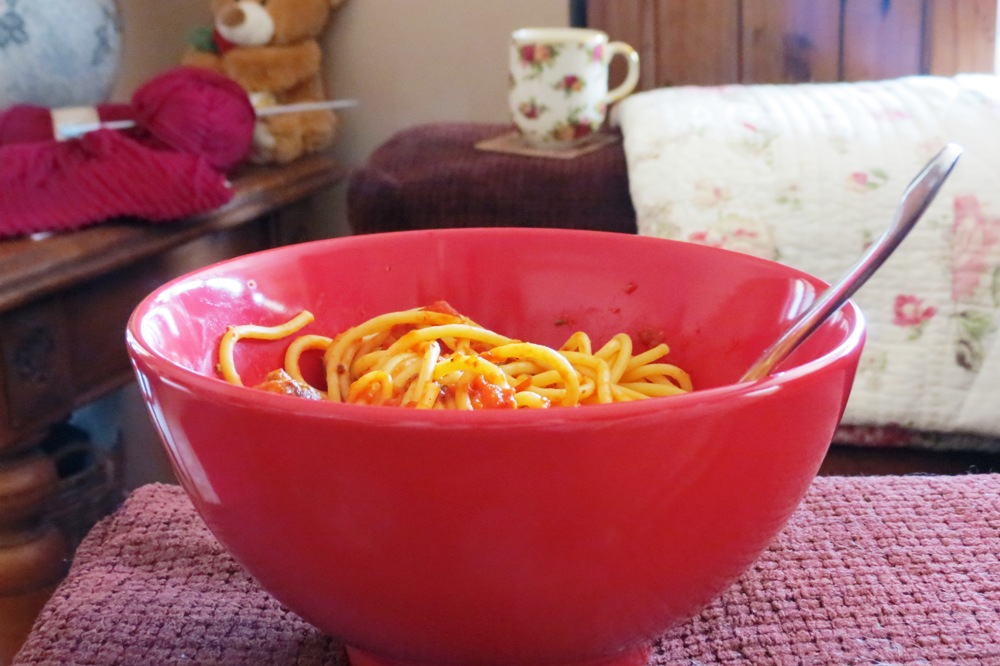
Stacy, I’ve added two paragraphs just below the photo of the bowl of food. I find this section (disliking red) of great interest as too much red really does unsettle me and I wonder if perhaps that is the reason you don’t like the colour yourself. I’m really enjoying this topic on colours, it so complex! 🙂
LikeLike
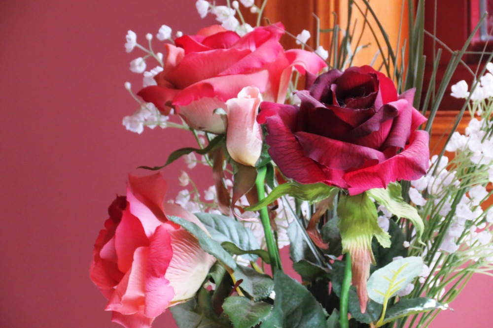
love the cup and quilt with the roses and the real roses. I can almost smell them.
Two of the walls in my living room are brick red. Guess that makes me a fan too.
LikeLike
I’m picturing a deeper tone of red when you say you have brick red walls Sybil, so again, that suggests a more quietly confident person. I wonder if there are any people who actually favour “fire engine” red? I don’t think I’ve ever met a single one!
LikeLike
That’s a beautiful picture of Miss Tibbs! Color psychology is fascinating and I enjoyed reading about the meanings behind red.
My son showed a marked early preference for red – I fact, I used to tie a red sock around one of his crib rails and he would stare at it, settle down and fall asleep. He’s 37 now and mostly wears red shirts and drives a red Jeep.
Besides most shades of my favorite color blue, from indigo to chambray, I also love burgundy, plum and eggplant from the red and purple palette. And for some reason I find most yellows unappealing…
LikeLike
Miss Tibbs says thank you Barbara. 🙂 She’s a very photogenic little lady.
What a coincidence, my 27 year old son has always had a liking for red too (the fire engine red shade!) When he was little, he wanted everything red, but we drew the line at paintng his walls red! He sold a car only a year ago, which he’d had for eight years, and yes, you guessed it, it was bright red.
Interesting you should say you don’t like yellow too, I’m rather looking forward to researching the psychology behind yellow, as I’m not fussed either, yet it is such a bright and happy colour!
LikeLike
I read your update on not liking the color red – difficulty in dealing with anger. Yes, I can totally relate to that – makes sense to me! ❤
LikeLike
It does to me too Stacy. 🙂
LikeLike
Finally posted on brown! Thank you for the idea. ❤
http://stacyallbritton.com/2013/04/18/surrounded-in-brown/
LikeLike
I didn’t want to reply to you here until I had read your post Stacy. Isn’t it incredible how we can get such an impression of a person without even meeting them? The colour suits your personality so perfectly from the Stacy I have come to know over the internet! I feel as though you are a very warm person, just as the colour brown is such a warm colour. I’m so glad that you joined in on Karma’s colours photo challenge. 🙂
LikeLike